

Responsive Web Design
A “responsive” website is one that presents users a good, readable, usable version of their web pages on all devices from desktop, to laptop, to tablet, to iPad, to smartphones and other mobile devices.
What is Responsive Design?

What is Responsive Design?
Responsive pages do not look the same on both large and small screens, instead they reformat to best support the size and type of device being used.
The Challenges of Responsive Design

The Challenges of Responsive Design
To make your website work in every popular screen size and resolution is a significant challenge. Content that views well on a large TV screen can’t simply be shrunk to a small smartphone size and still be readable.
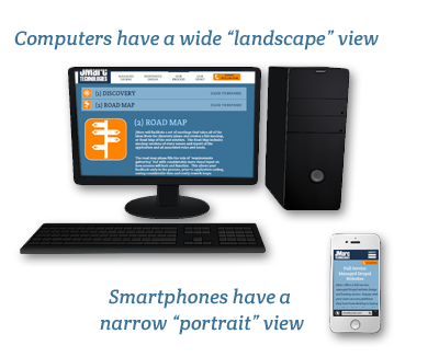
On one side of the spectrum are huge HD resolutions in "landscape" on desktops/TVs and on the other end are the small screens of smartphones in "portrait". Tablets sit some where in the middle, but many users will alternate between "landscape" and "portrait" depending on the content or personal preference.
Why care about Responsive Design?
Why care about Responsive Design?
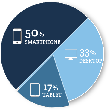
Users are already viewing your site on a smartphone!
- In Q4 of 2014, over 67% 1 of emails were opened on a mobile device!
- 64% of American adults now own a smartphone of some kind, up from 35% in the spring of 2011. 2
- 10% of Americans own a smartphone but do not have any other form of high-speed internet access at home beyond their phone’s data plan. 2
1 http://info.movableink.com/Device-Report-Q4-2013
2 http://www.pewinternet.org/2015/04/01/us-smartphone-use-in-2015/
Why not build an App Instead?
Why not build an App instead?
Instead of a Responsive website, another option is to create a version of the site for each type of smart phone (Apple, Google, Microsoft, etc.) as an “App” – a specific version, coded for the specific device. An App can be the optimal experience, but companies have to support four (or more) complete development efforts – which is prohibitively expensive in most cases.
When does an App make sense? When the content must be available even if the user is not actively on the Internet. Games, phone utilities, and other specific uses.
Tips for Good Responsive Design
Tips for Good Responsive Design
- Use large, readable fonts with generous spacing
- Web pages should change for different resolutions, each designed differently to maximize their effectiveness
- Think in columns and scrolling (try to forget tables and cells)
- Outsource development to a team who knows how to build and manage Responsive websites
- Test, test, test!
- Check using Google’s site analyzer (click here)
The below video is a brief primer on Responsive Web Design, why you should care about it, and how to best develop sites in this style.
More Questions?
Do you have more questions about how Responsive Web Design can impact your website's goals? Contact Us and our representatives will be happy to provide you with more information